Beyond the Finish Line: What Your Race Bib Is Really Telling Race Organizers
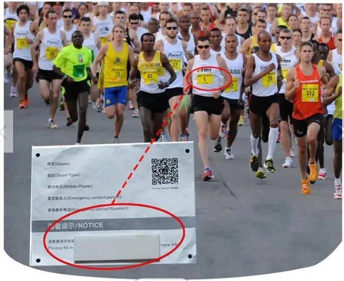
Photo: runner race bib number timing chip marathon finish line, via chiprfid.vn
The small chip embedded in your race bib does far more than record when you crossed the finish line. Race directors, urban planners, and sports scientists are mining the timing data generated by tens of thousands of runners to reshape course design, improve event safety, and identify performance patterns across age and gender demographics. Understanding what that data reveals — and how to use it yourself — could be the training edge you have been overlooking.
The Data Engine Pinned to Your Chest
Every time you register for a certified road race in the United States, you enter into a data relationship that most participants never fully appreciate. Your race bib — and the Radio Frequency Identification chip it carries — becomes a moving sensor for the duration of the event. As you pass over timing mats embedded at the start, at mile markers, and at the finish, each crossing generates a timestamp linked to your unique registration record.
Multiply that data point by 30,000 runners at a major city marathon, and the aggregate result is an extraordinarily detailed dataset capturing human movement through urban space under competitive conditions. Race organizers, timing companies, and in some cases municipal transportation authorities receive access to information that extends well beyond the leaderboard.
"We are not just producing results," noted one race operations director at a large regional running series in the Midwest. "We are producing a map of how people move through a course, where they slow down, where they bunch up, and what that means for the next time we run this event."
Decoding Course Congestion
One of the most practically significant applications of aggregate timing data is the identification of bottlenecks — points along a course where runner density increases sharply, pace slows involuntarily, and the risk of falls or collisions rises. These congestion signatures appear clearly in split data when a large number of participants record anomalously slow segment times relative to their overall pace.
Narrow bridge crossings, sharp turns onto sidewalks, and water station placements are common culprits. At several major American road races, post-event data analysis has prompted organizers to widen course entry points, relocate aid stations, or restructure wave start assignments to distribute runner density more evenly across the early miles.
The 2020s have seen an increasing number of race directors commissioning formal data reviews following their events. By comparing split distributions across multiple years of the same course, organizers can measure whether course modifications actually improved flow — a feedback loop that was essentially impossible before comprehensive chip timing became standard.
For runners, this analysis carries a practical implication: the splits recorded on your results page are not always a pure reflection of your fitness. A slow third mile may reflect a course bottleneck rather than a personal performance deficit. Reviewing segment data in context — particularly by comparing your splits against the median for your starting corral — provides a more accurate picture of where you genuinely lost time.
Age, Gender, and the Performance Landscape
Timing databases accumulated over years of major road racing events represent one of the most comprehensive records of human endurance performance ever assembled. Researchers affiliated with universities and sports medicine organizations have used this data to map performance decline curves across age groups, examine gender-based pacing strategy differences, and identify the age ranges at which runners tend to achieve lifetime personal bests.
Findings from analyses of large American marathon datasets — including publicly available results from the Boston, Chicago, and New York City Marathons — have consistently shown that male runners tend to go out faster relative to their finishing pace, while female runners more frequently execute negative splits or even pacing. Age-group data reveals that masters runners, particularly women in the 50-to-59 age bracket, have shown measurable performance improvements over the past two decades, a trend attributed partly to increased participation and partly to improved training methodology among recreational athletes.
For the individual runner, understanding where your performance sits within your age and gender cohort provides context that a finish time alone cannot offer. A 3:45 marathon means something different for a 28-year-old male in a competitive urban market than it does for a 58-year-old woman competing at a regional event. Age-graded performance calculators, many of which draw on the same underlying datasets, allow runners to make meaningful cross-demographic comparisons.
Reading Your Own Splits Like a Coach Would
Your official results page, available through the timing company contracted for your event, typically contains more actionable information than most runners take the time to examine. Here is a systematic approach to extracting genuine training insight from your post-race data.
Start with your split progression. List your recorded times at each checkpoint and calculate the pace per mile or kilometer for each segment. A well-executed race will show a relatively consistent pace, or a slight negative split in the second half. Significant positive splits — where later segments are meaningfully slower than earlier ones — indicate that you went out too fast, encountered a course challenge, or experienced a physiological breakdown in the back half.
Compare your splits to your seeding. Most large races assign corrals based on submitted projected finish times. If your early-mile splits are substantially faster than your corral's median pace, you may have started in a wave that was too slow for your fitness level, or — more commonly — you went out with the excitement of race day rather than your training-calibrated pace.
Identify your critical mile. Nearly every runner has a segment where their pace deteriorates most sharply. This is your diagnostic data point. If it consistently occurs between miles 18 and 20 in a marathon, your long-run training volume may be insufficient. If it appears at mile 8 of a half marathon, your threshold pace work deserves closer attention.
Use your overall placement within your age group. Finishing in the top 20 percent of your age group at a well-attended event carries more statistical meaning than your absolute time. Age-group placement accounts for the competitive field on that day and at that location, giving you a relative performance benchmark.
The Broader Value of Participation Data
Beyond individual performance analysis, the aggregate timing data generated by American road races serves a function that most participants would not anticipate: urban infrastructure planning. Cities that host large-scale running events — including those that close major thoroughfares for hours at a time — have begun using participant flow data to inform traffic management strategies and emergency response positioning.
Public health researchers have also drawn on race registration and results data to study physical activity patterns across demographic groups, geographic regions, and income levels. The picture that emerges from this research is both an argument for the continued growth of participatory running events and a guide for making those events more accessible and representative.
Your Bib, Your Data
The next time you pin on your race number and step to the starting line, consider what that small rectangle of paper and circuitry actually represents. It is your individual identifier within a sophisticated performance tracking system — one that records your effort with precision, aggregates it with thousands of others, and generates insights that shape the future of the sport.
At RR Timing Results, we believe that data is most valuable when it is understood. Your splits, your age-group placement, your segment comparisons — these are not merely numbers on a results page. They are the raw material of better training, smarter racing, and a deeper understanding of your own performance. Every second counts. Start counting yours.